Misuse Examples
This page features examples of signatures being used incorrectly and how to correct it. To review the full guidelines which include clear space, minimum size, color and more, view the Guidelines for Using Signatures. If you have questions, reach out to identity@missouri.edu.
Acronyms
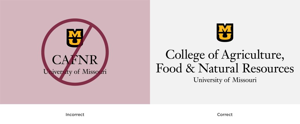
Signatures do not include acronyms. The full unit name must be included in the signature. Acronyms may be used on second reference in copy.
Alterations
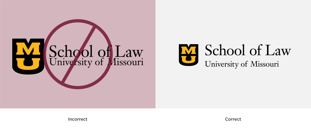
Signatures may not be altered or recreated. This includes resizing any part of a signature, using a different font or adding text and graphics. Do not create your own signature. Only official signatures provided by Licensing and Brand Management may be used.
Backgrounds
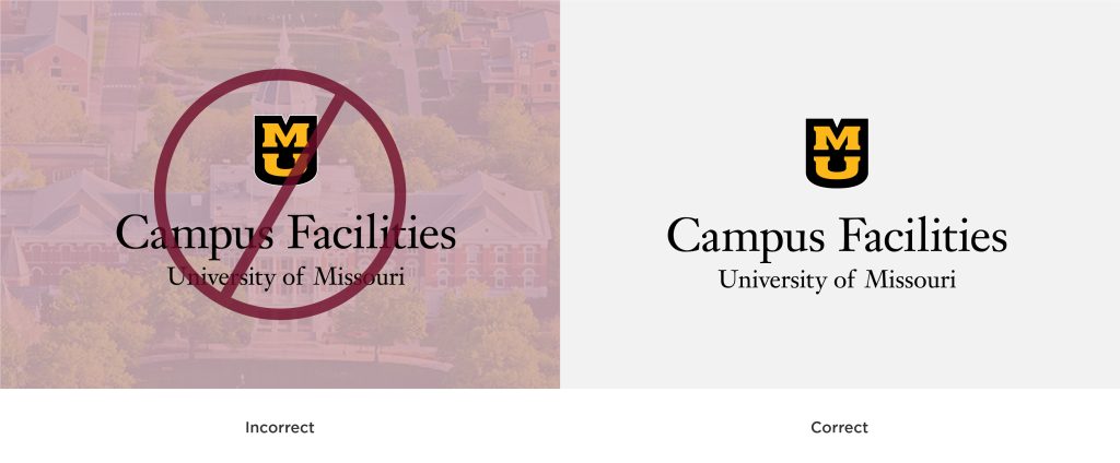
Do not place signatures over photos or busy backgrounds.
Color
Do not invert the colors of the Stacked MU or recolor signatures. When using the one-color signature the “MU” should always be lighter than the shield.

Distortion
Do not stretch or distort signatures in any way.

Effects
Do not add effects to signatures. This includes, but is not limited to, drop shadows, bevels, embossing, outlines, and inner or outer glows.

Multiple Signatures
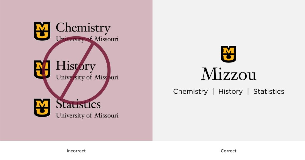
Do not use multiple signatures on any material. Instead, use a multi-unit signature. Reach out to reach out to identity@missouri.edu to request this setup.
Orientation
Signatures should not be rotated or angled unnaturally. Ensure signatures are always oriented in a way that is visually natural to the viewer on both digital and print materials.
