Mizzou’s brand graphics support our photography and typography to create a unique visual framework for delivering our messages. Review these guidelines before using brand graphics to create on-brand marketing materials tailored to your audience. For design inspiration and examples, view the Mizzou Brand Showcase.
Brand graphics are available to Mizzou employees through the Mizzou Brand Toolkit.
Jump to:
Highlights & Underline Styles | Pattern Collection | Arrows | Container Collection | Footers | Photo Grids | Lower Thirds | Video Bumpers | Anniversary Graphics
Highlight & Underline Styles
The Highlight and Underline styles drive typographic hierarchy, bringing attention to important parts of our messaging. Each style has been developed to ensure legibility and consistency.
When using these styles:
- Review each style’s guidelines and the typography guidelines.
- Always choose the correct style for the content.
For example, Highlight One may only be used for headers, it may not be applied to a subhead. - Do not pair two styles next to each other.
For example, if you apply the Underline style to your header, the subhead may not use a Highlight or Underline style and vice versa. - Do not recolor the styles. Only the colors listed here may be used. Do not use accent colors for the text, Highlight style or Underline Style.
- Accessibility and legibility should always be the priority when using these styles. If use of a style makes copy inaccessible, the style must be removed from the copy.
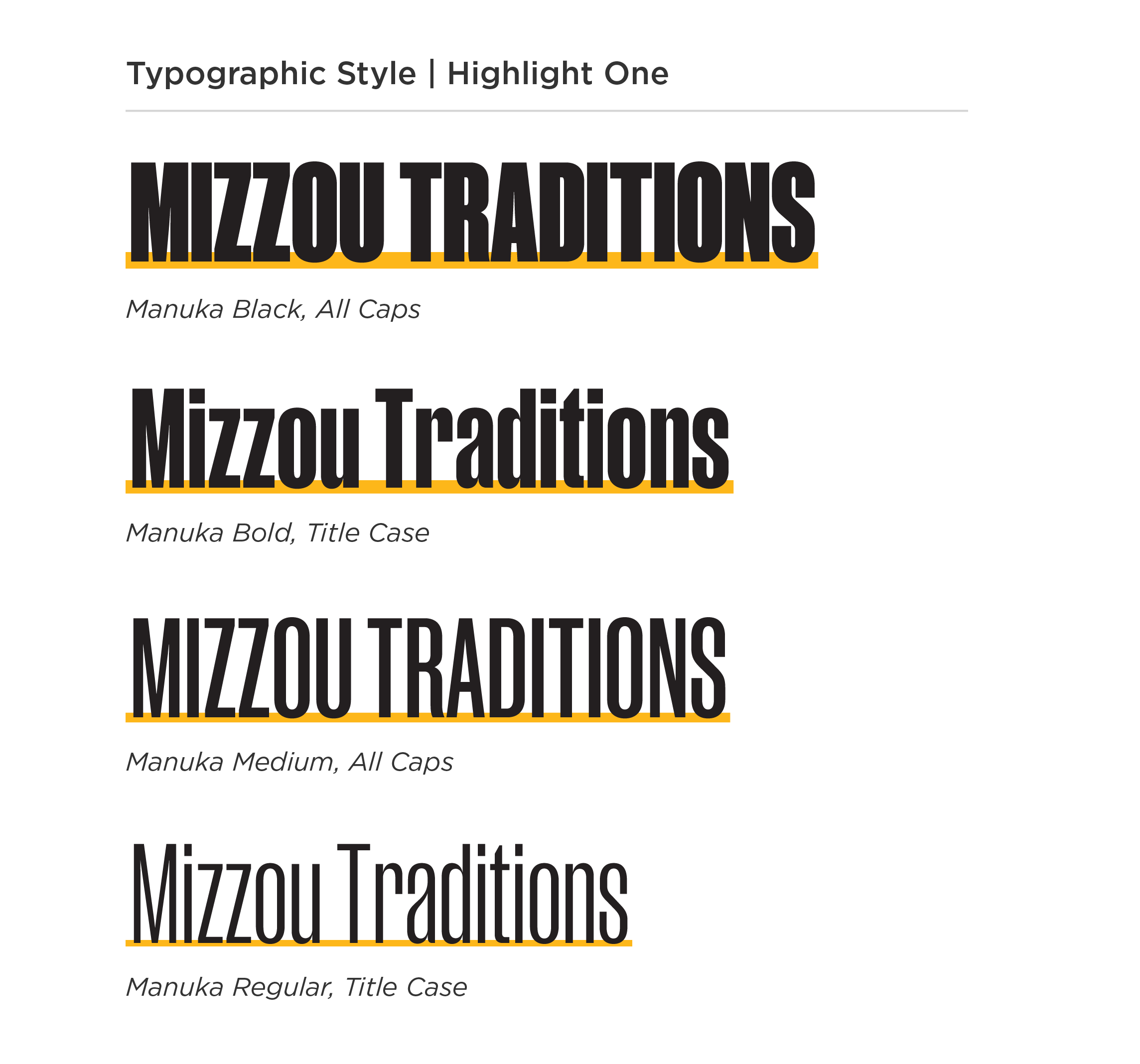
Highlight One
Highlight One is used with the brand font Manuka (all weights). It may be used in title case or all caps.
Approved color combinations:
- Black text, gold highlight
- Black text, white highlight
Use Highlight One for:
- Headlines
- Mastheads
- Statistics and numbers
Do not use Highlight One for:
- Body copy
- Captions
- Contact information
(URLs, phone numbers, email addresses, etc.) - Emphasis
- Quotes
Highlight One Guidelines & Best Practices

COLOR
Approved colors for Highlight One include black text with a gold or white highlight.
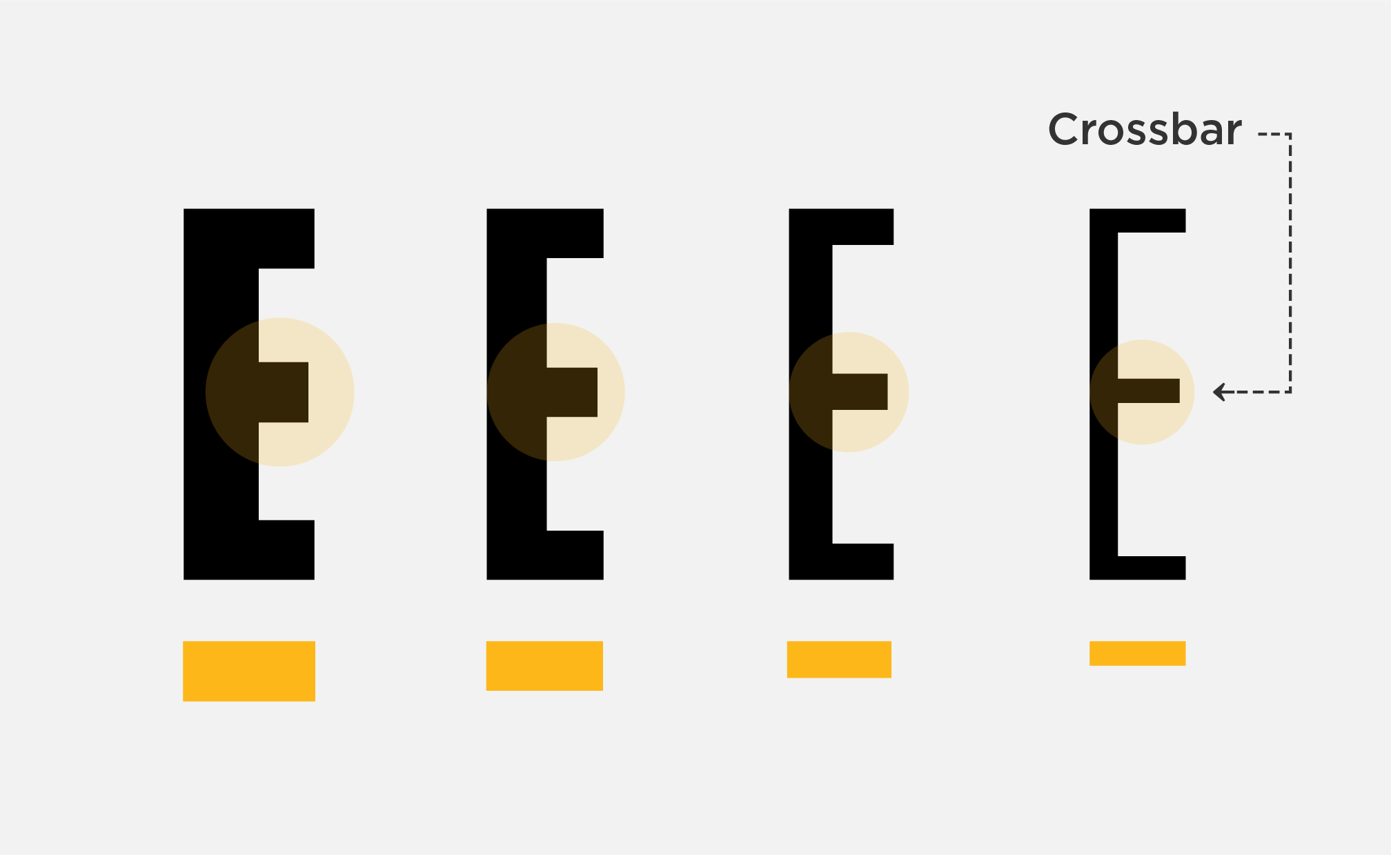
HIGHLIGHT WIDTH
Highlight One’s width must match the crossbar in the ‘E’ of the weight of Manuka used.
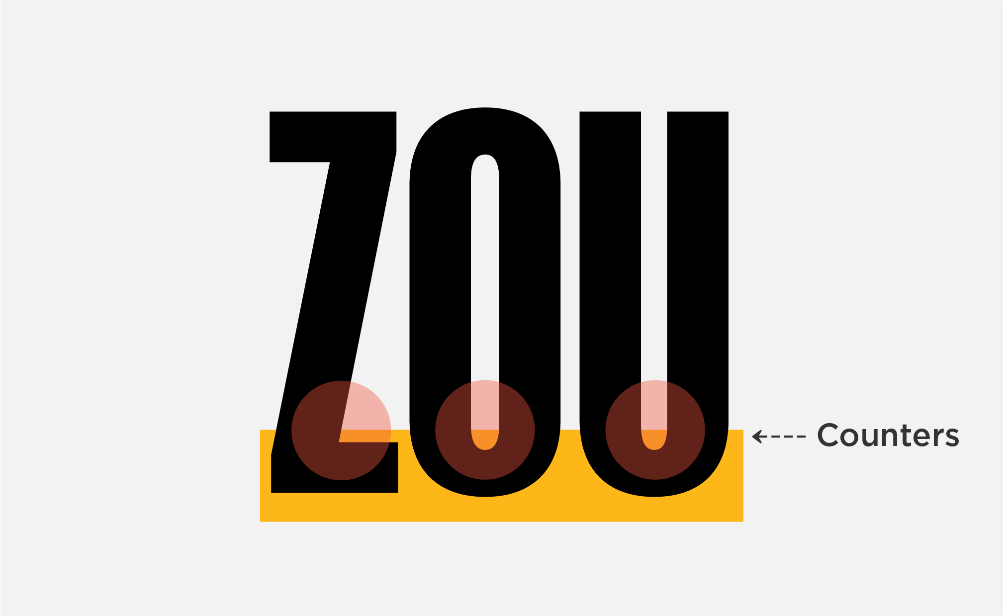
INCORRECT ALIGNMENT
The highlight must not be visible within counters of letters. If it is visible, the placement or thickness is incorrect.

INCORRECT PLACEMENT
Highlight One must be centered vertically with the text baseline. It may not be aligned with the cap height.
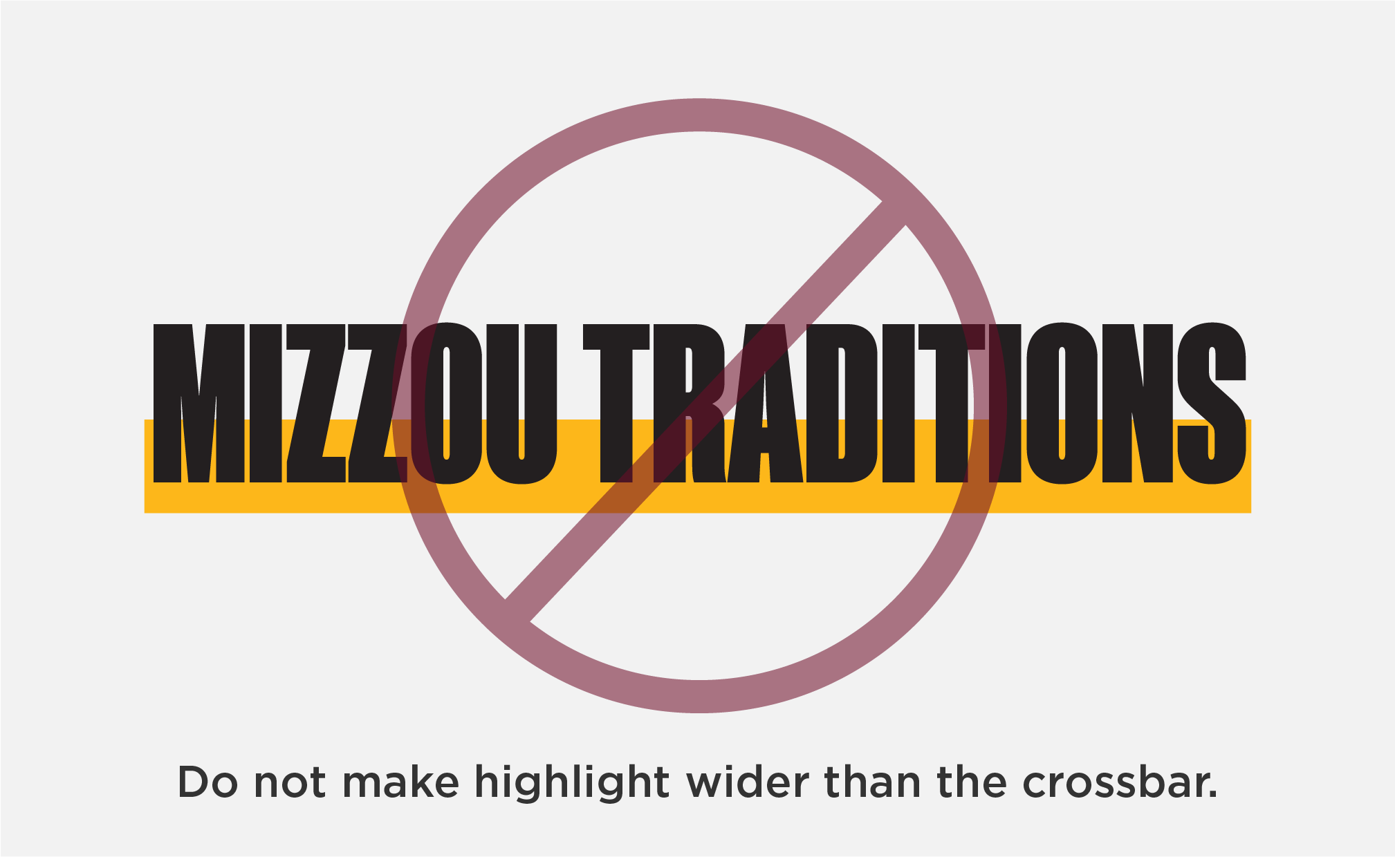
INCORRECT WIDTH
The width of the highlight must be proportional to the weight of Manuka used.
INCORRECT LENGTH
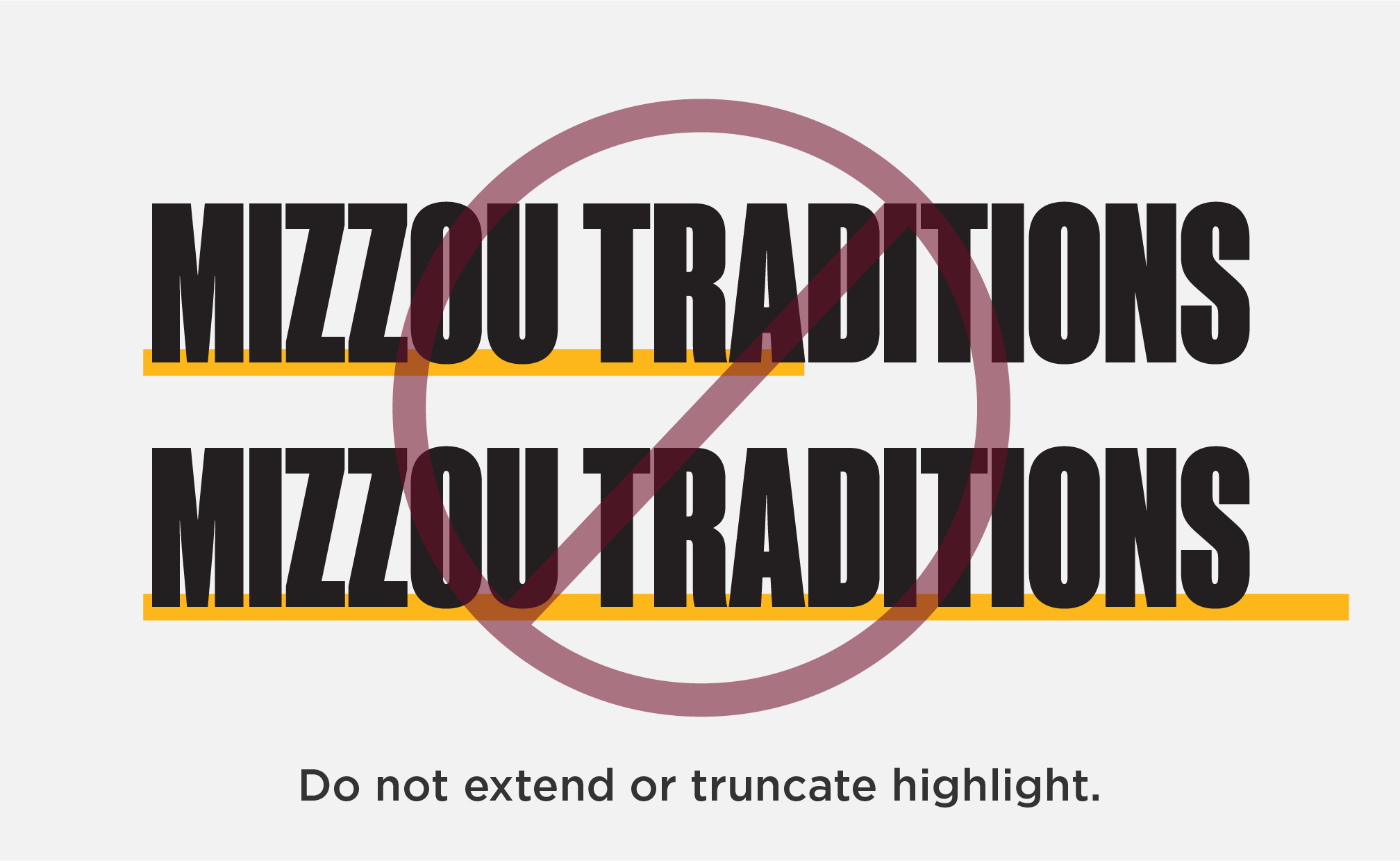
Highlight One may not be truncated mid-word/phrase or extended beyond it.
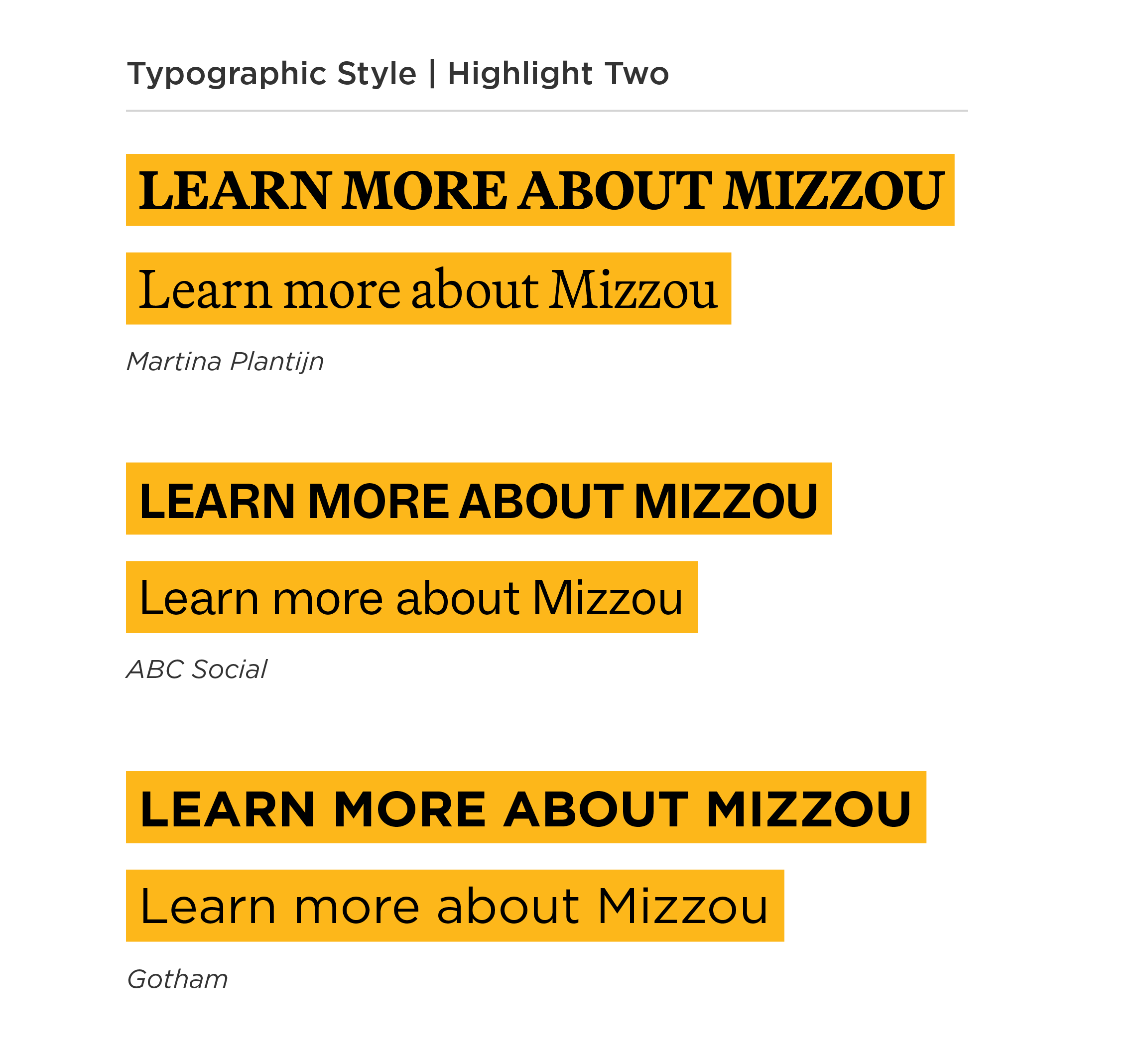
Highlight Two
Highlight Two may be used in any weight of the brand fonts Martina Plantijn, ABC Social and Gotham. All case types may be used (sentence case, title case and all caps.)
Approved color combinations:
- Black text, gold highlight
- Black text, white highlight
- Gold text, black highlight
- White text, black highlight
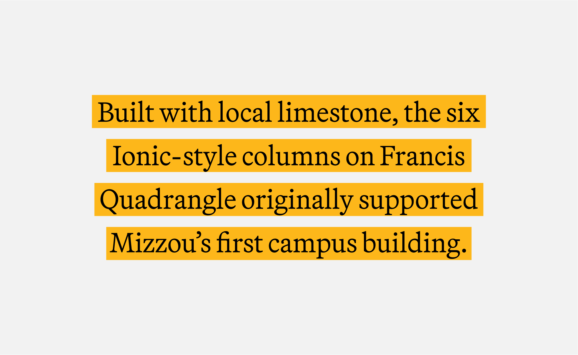
Use Highlight Two for:
- Calls to action (CTAs)
- Captions
- Emphasis
- Statistics and numbers
- Subheads
- Quotes
- URLs
Do not use Highlight Two for:
- Body copy
- Contact information
(phone numbers, email addresses) - Headlines
- Mastheads
Highlight Two Guidelines & Best Practices

CORRECT SIZING
Highlight Two must be tight to the text, but leave enough space between the highlight and the text’s ascenders and descenders.

INCORRECT | TOO LARGE
This is an example of Highlight Two with too much space around the text.

INCORRECT | TOO SMALL
This is an example of Highlight Two with too little space around the text.
LEADING
When Highlight Two is applied to multiple lines of copy, there must be adequate leading to create separation.

COLOR | ACCESSIBILITY
Do not use white text with a gold highlight.

ACCENT COLORS
Do not use accent colors for the text or highlight.
Underline Style
The underline style may be used in any weight of the brand fonts Martina Plantijn, ABC Social and Gotham. All case types may be used (sentence case, title case and all caps.)
Approved color combinations:
- Black text, gold underline
- Black text, white underline
Use Underline style for:
- Calls to action (CTAs)
- Captions
- Emphasis
- Headlines
- Mastheads
- Statistics and numbers
- Subheads
- Quotes
- URLs
Do not use Underline style for:
- Body copy
- Contact information
(phone numbers, email addresses)
Underline Guidelines & Best Practices

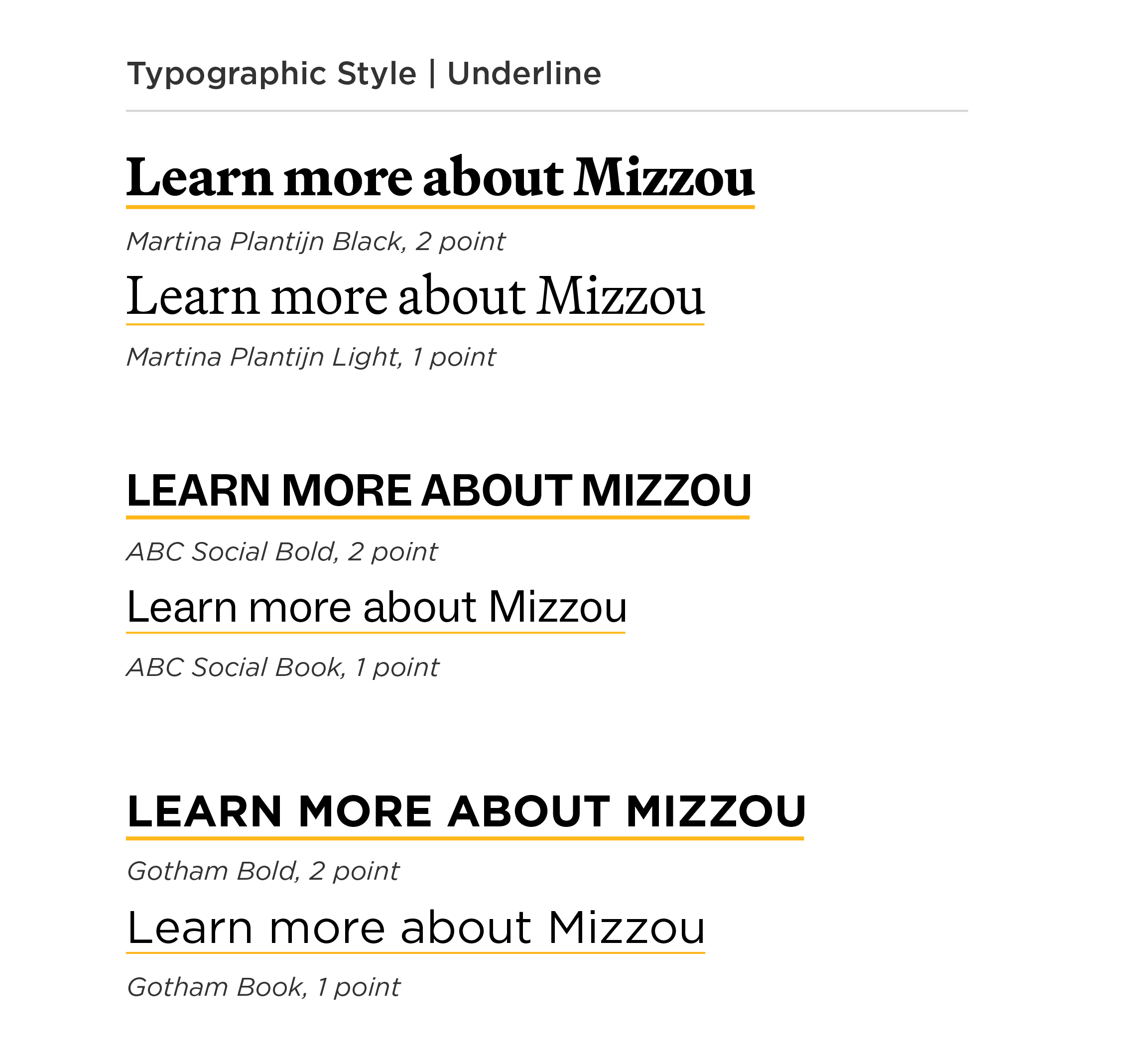
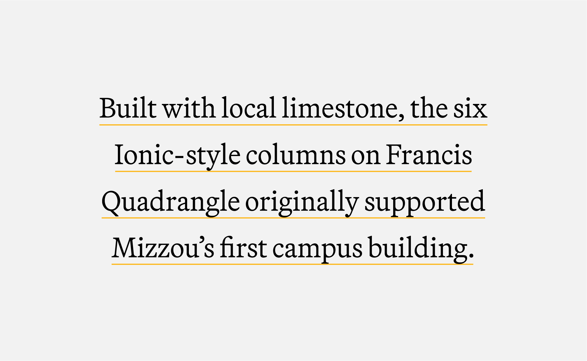
CORRECT SIZING
The underline weight must be 1 point. If text size is above 24 points or a bolder weight, use 2 points for balance.
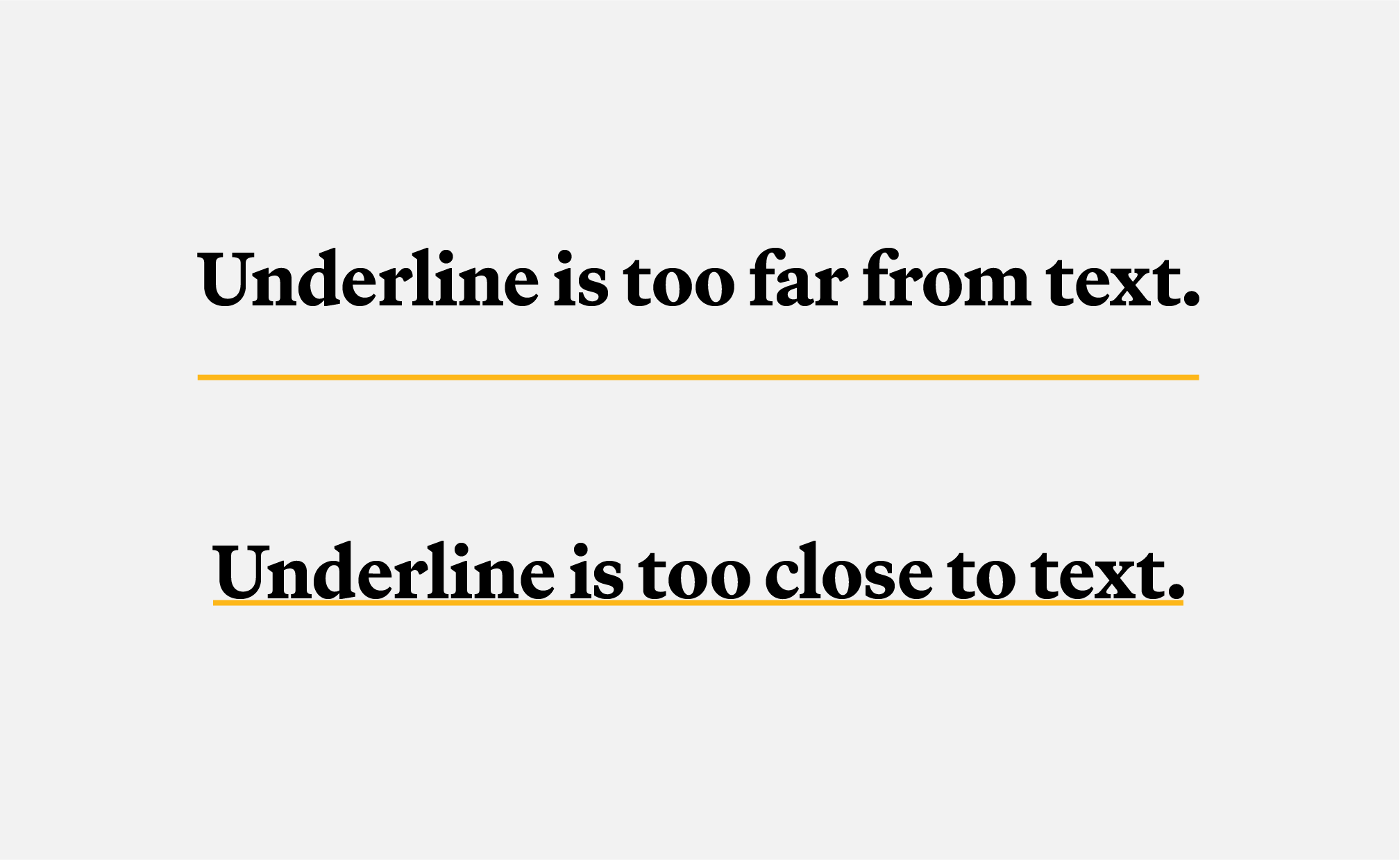
UNDERLINE OFFSET
Offset the underline from the text by 5 pixels. If underline is placed directly beneath text, select it and hit the down arrow 5 times.
LEADING
When underline is applied to multiple lines of copy, there should be adequate leading to create separation.

INCORRECT LENGTH
Do not extend the underline beyond the copy or truncate it mid-word/phrase.

COLOR | ACCESSIBILITY
Do not use gold text with a white or black underline.

ACCENT COLORS
Do not use accent colors for the text or underline.
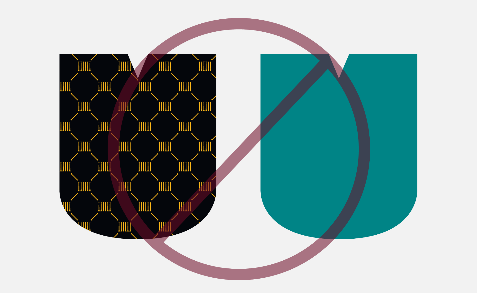
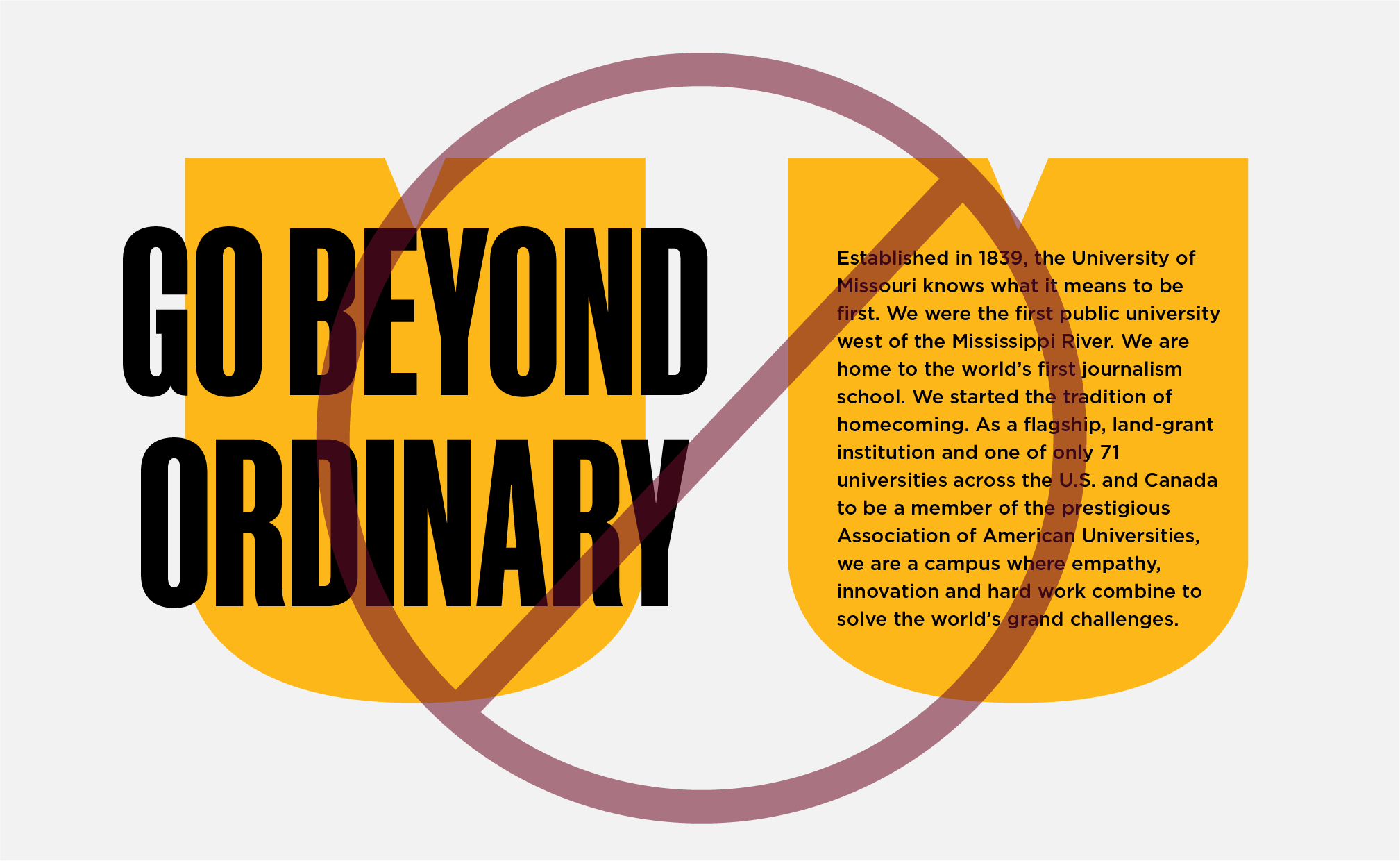
Pattern Collection
Mizzou’s pattern collection pulls from our history and evergreen identity, bringing visual interest and depth to our designs and strengthening our brand. Patterns may be mixed and matched on the same material.
When using the pattern collection:
- Do not recolor patterns. Only the colors shown may be used.
- Tone-on-tone patterns should be the primary use case.
- Full-strength patterns should be used sparingly and may not be overlayed with copy.
- Legibility and accessibility of our materials is important. If use of a pattern makes information inaccessible, the pattern must be removed from the design.
- Always use the correct pattern orientation.
The following patterns must be rotated 40 degrees: Mizzou 1839 Alternate, M-I-Z Stripes and Tiger Stripes.
The pattern collection may not be recolored to include the neutral or accent colors.

Copy may not be placed on any full-strength patterns.
The Tiger Stripes and M-I-Z Stripes patterns must be rotated 40 degrees and scaled to avoid waves and obvious repitition.
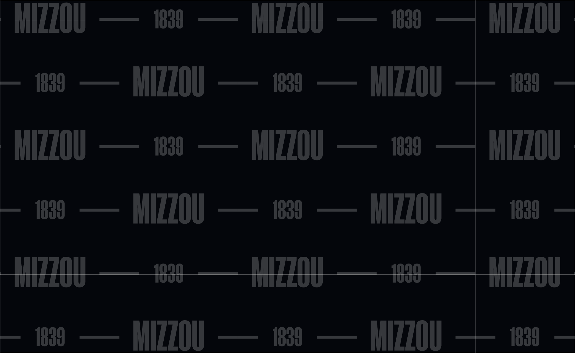
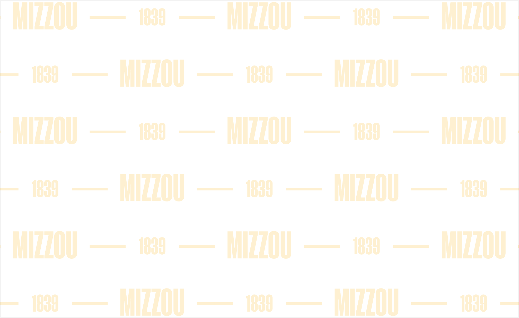
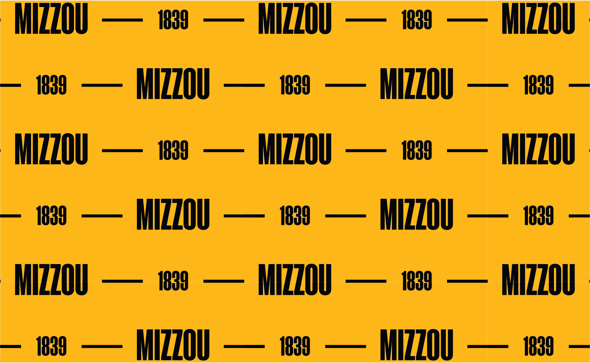
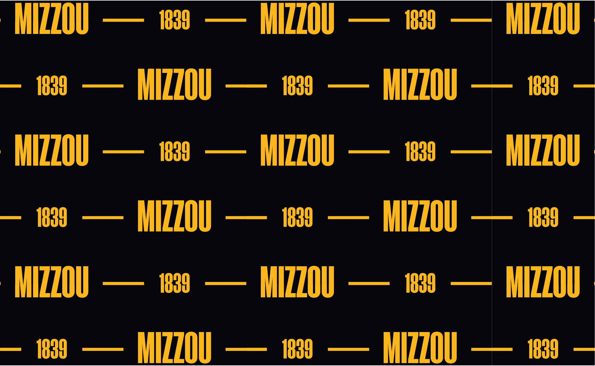
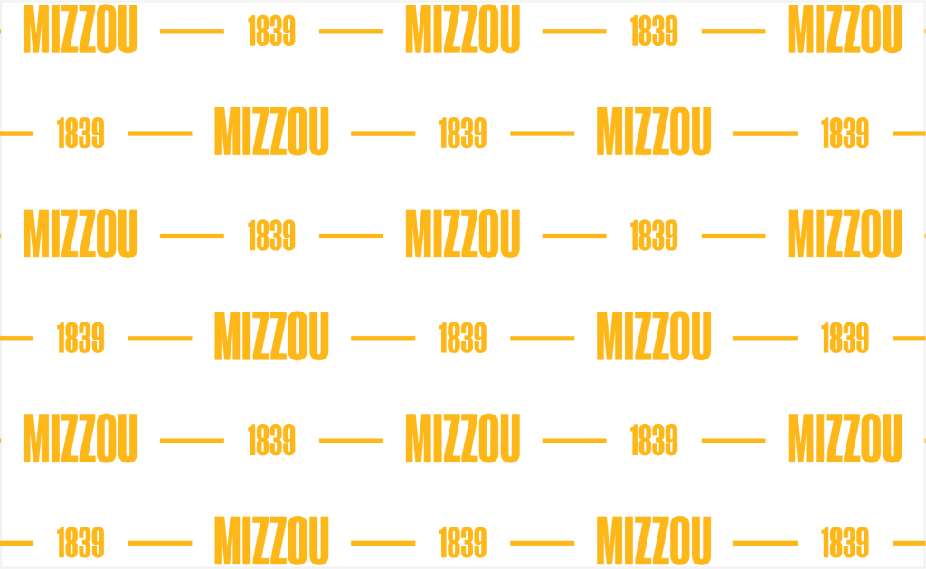
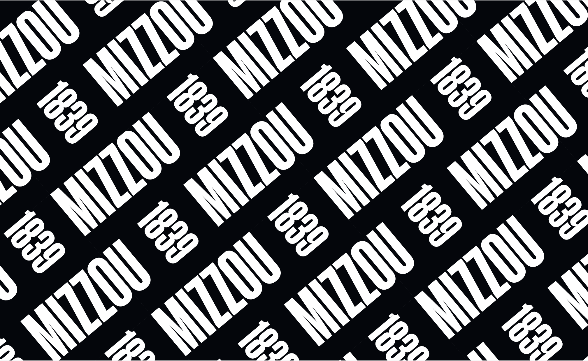
Mizzou 1839
This typographic pattern is a direct nod to the university and its founding year, creating a versatile element that complements our brand. The Mizzou 1839 pattern can be used across materials for all audiences.
Do not:
- Use full-strength patterns with copy overlay.
- Recolor patterns or adjust tone-on-tone opacity.
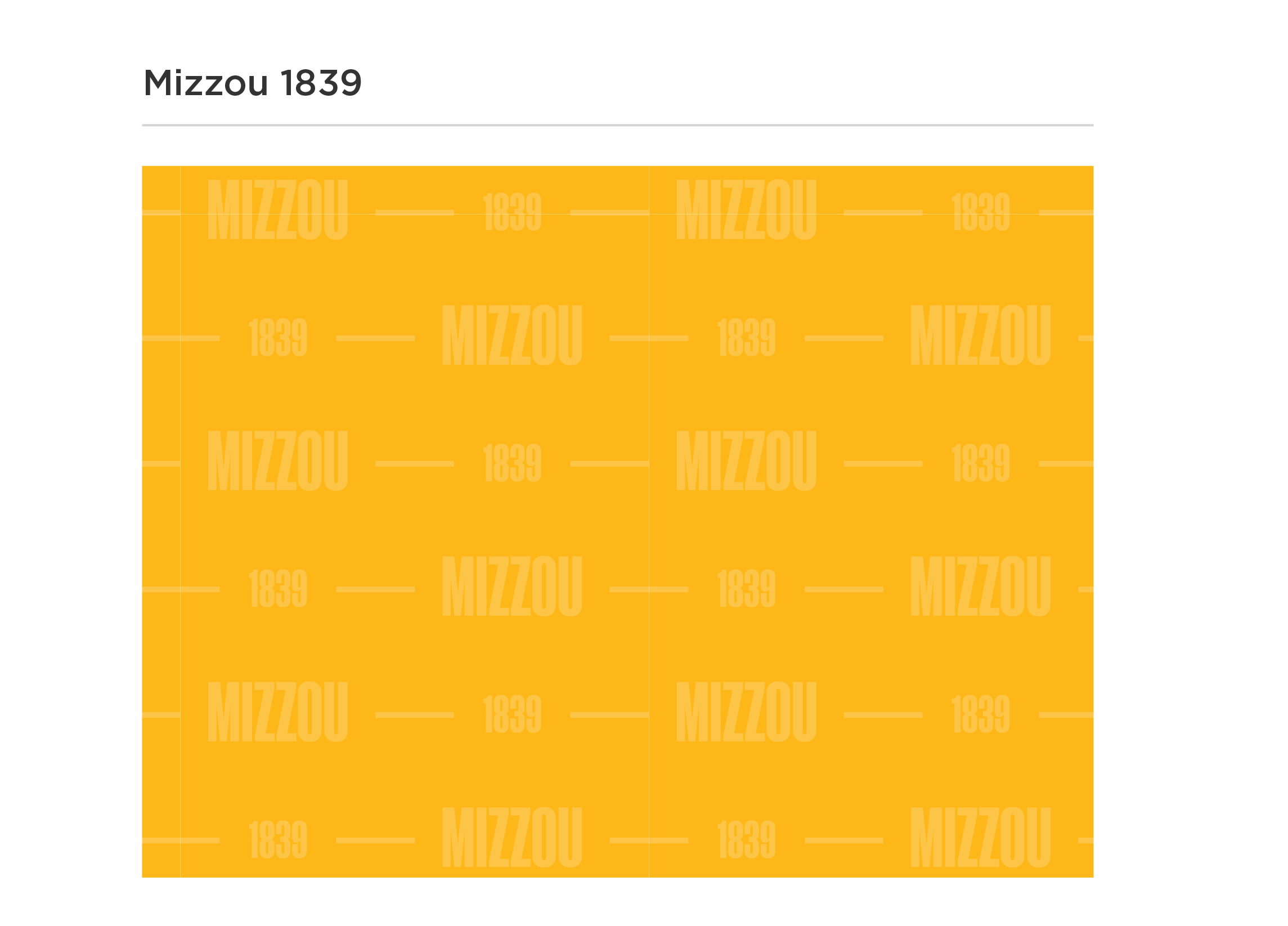
Color Variations
TONE-ON-TONE
The tone-on-tone patterns are the primary versions to use. Copy may be overlaid in the colors noted below.
Pattern: White, 20% opacity
Background: Black
Text Overlay: Gold, White

Pattern: White, 20% opacity
Background: Gold
Text Overlay: Black

Pattern: Black, 20% opacity
Background: Limestone
Text Overlay: Black
Pattern: Gold, 20% opacity
Background: White
Text Overlay: Black
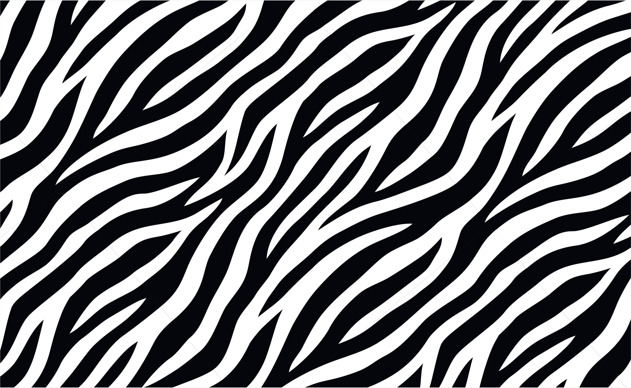
FULL-STRENGTH
Full-strength variations create a bolder graphic effect that may be used in place of full-page photos. These variations may not have copy placed on top of them.
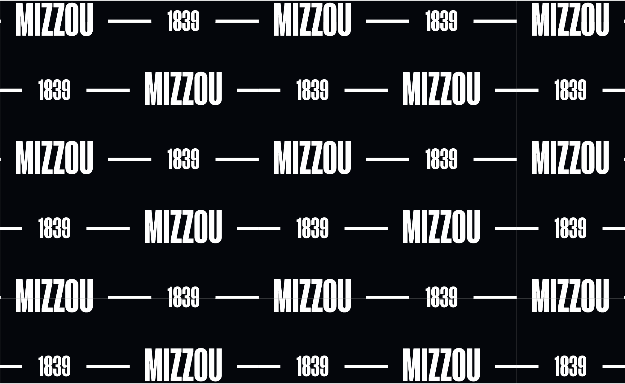
Pattern: White
Background: Black
Pattern: Black
Background: Gold
Pattern: Gold
Background: Black
Pattern: Gold
Background: White
Mizzou 1839 Alternate
This alternate version of the Mizzou 1839 pattern may be used with any audience, but is recommended for prospective and current students, faculty/staff and the general public.
When using this pattern:
- It must be rotated 40 degrees.
Do not:
- Use full-strength patterns with copy overlay.
- Recolor patterns or adjust tone-on-tone opacity.
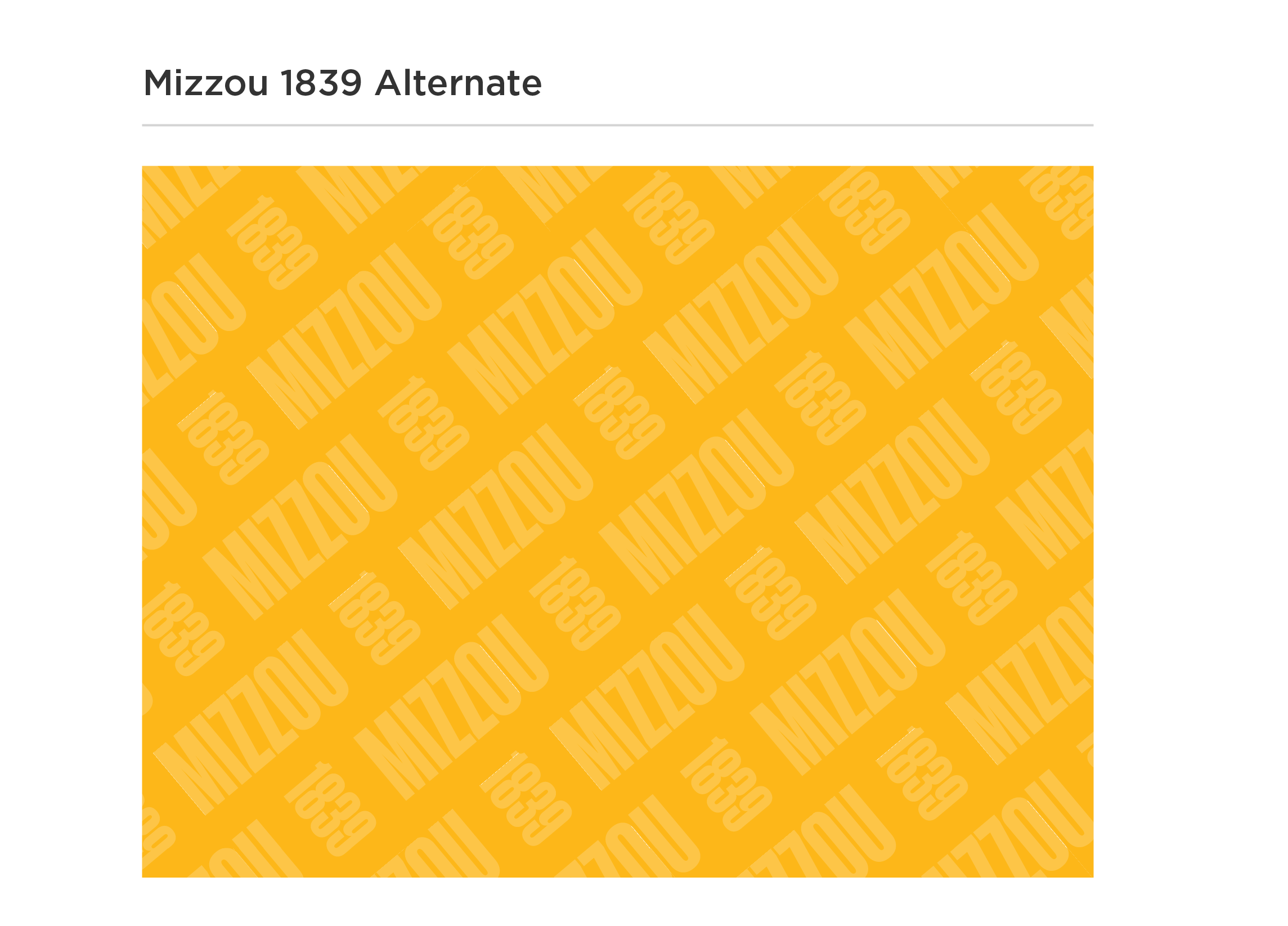
Color Variations
TONE-ON-TONE
The tone-on-tone patterns are the primary versions to use. Copy may be overlaid in the colors noted below.

Pattern: White, 20% opacity
Background: Black
Text Overlay: Gold, White

Pattern: White, 20% opacity
Background: Gold
Text Overlay: Black

Pattern: Black, 20% opacity
Background: Limestone
Text Overlay: Black

Pattern: Gold, 20% opacity
Background: White
Text Overlay: Black
FULL-STRENGTH
Full-strength variations create a bolder graphic effect that may be used in place of full-page photos. Do not place copy on top of full-strength patterns.
Pattern: White
Background: Black

Pattern: Black
Background: Gold

Pattern: Gold
Background: Black

Pattern: Gold
Background: White
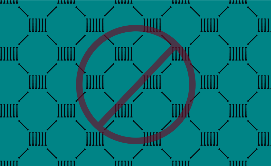
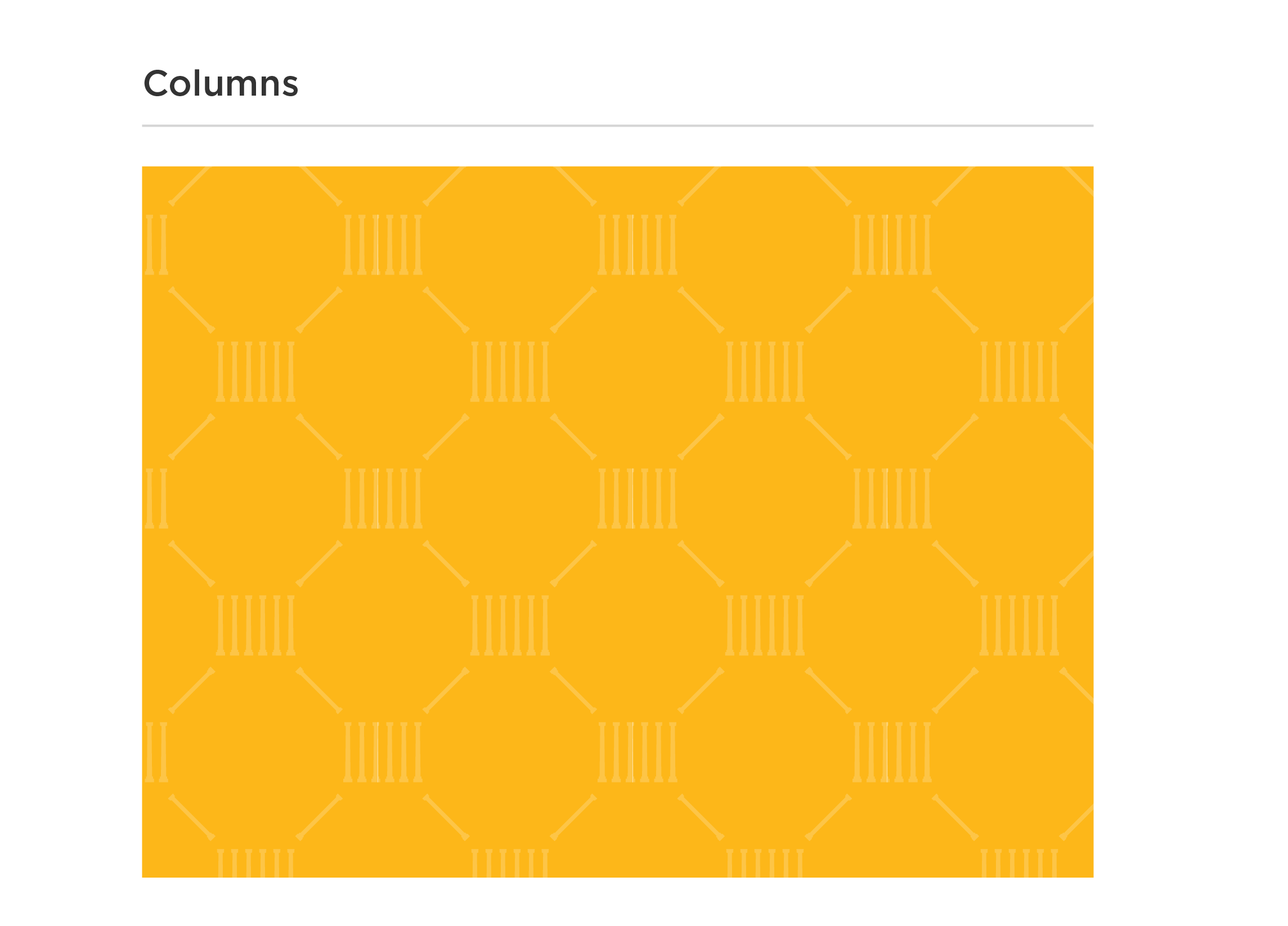
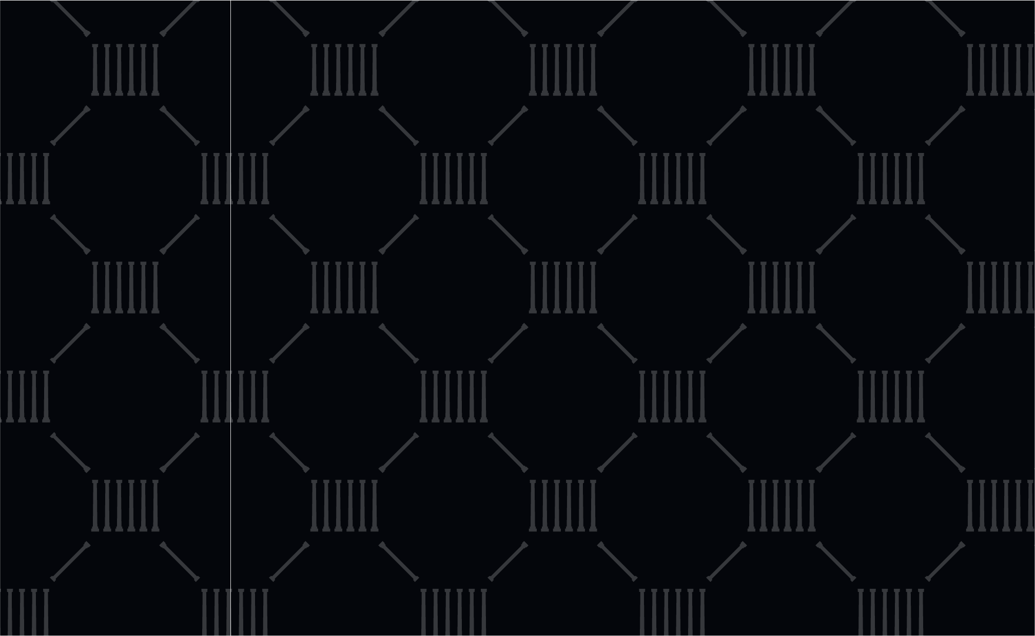
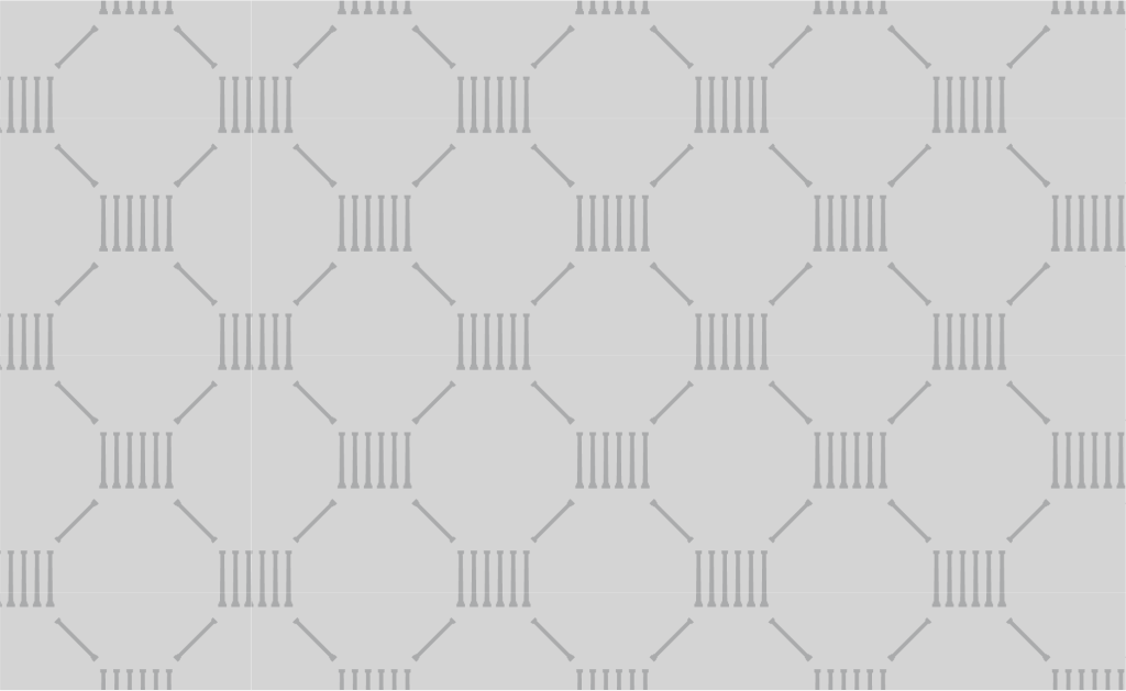
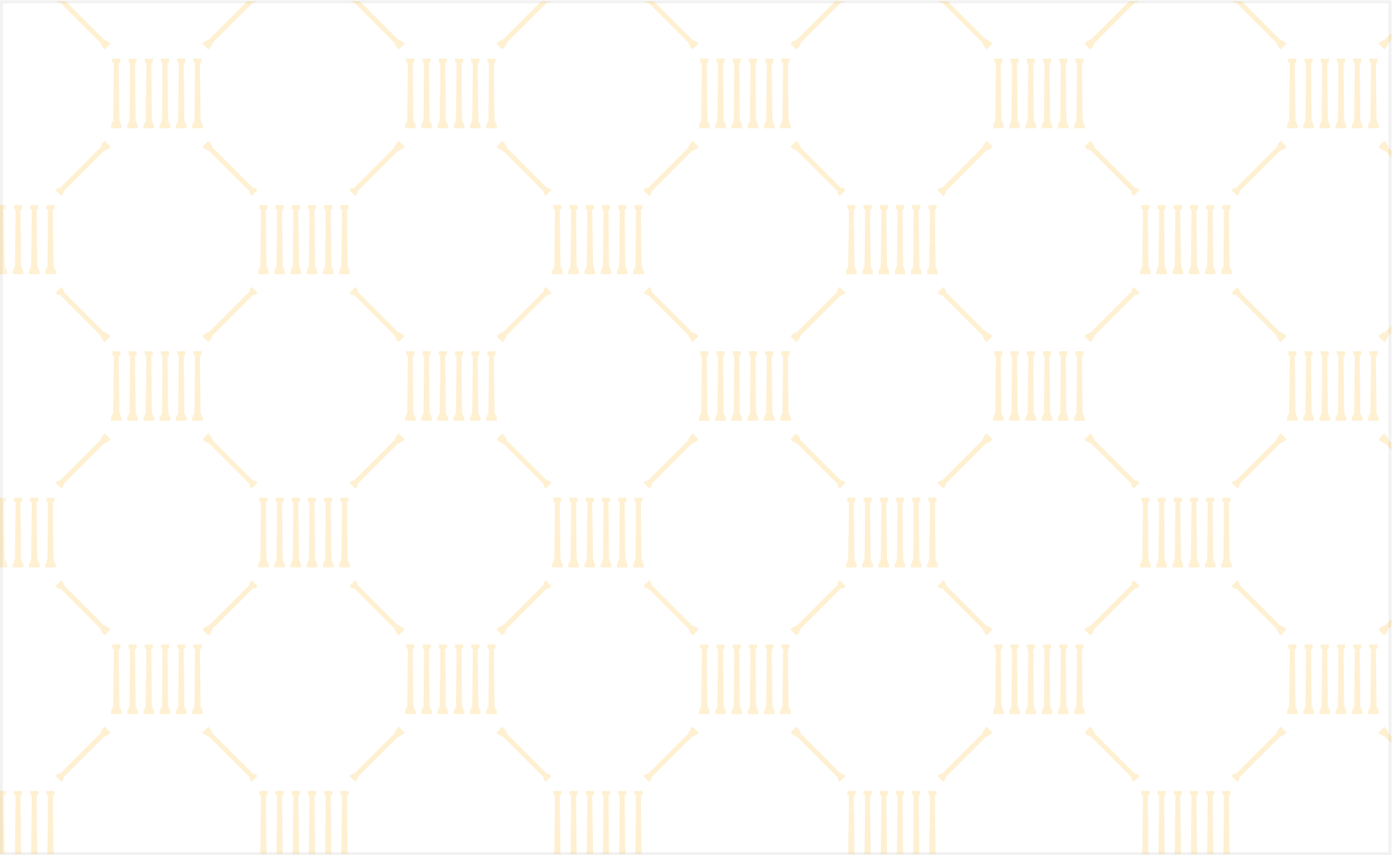
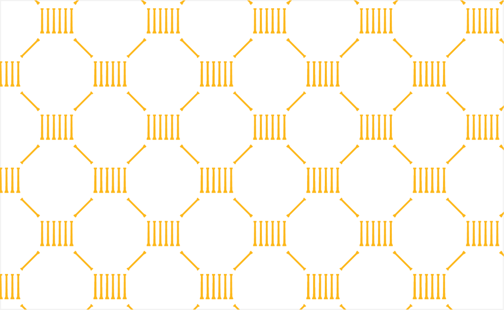
Columns
This traditional geometric pattern is inspired by our iconic Mizzou Columns. The Columns pattern works best as a decorative element.
Do not:
- Use full-strength patterns with copy overlay.
- Recolor patterns or adjust tone-on-tone opacity.
Color Variations
TONE-ON-TONE
The tone-on-tone patterns are the primary versions to use. Copy may be overlaid in the colors noted below.
Pattern: White, 20% opacity
Background: Black
Text Overlay: Gold, White

Pattern: White, 20% opacity
Background: Gold
Text Overlay: Black
Pattern: Black, 20% opacity
Background: Limestone
Text Overlay: Black
Pattern: Gold, 20% opacity
Background: White
Text Overlay: Black
FULL-STRENGTH
Full-strength variations create a bolder graphic effect that may be used in place of full-page photos. Do not place copy on top of full-strength patterns.
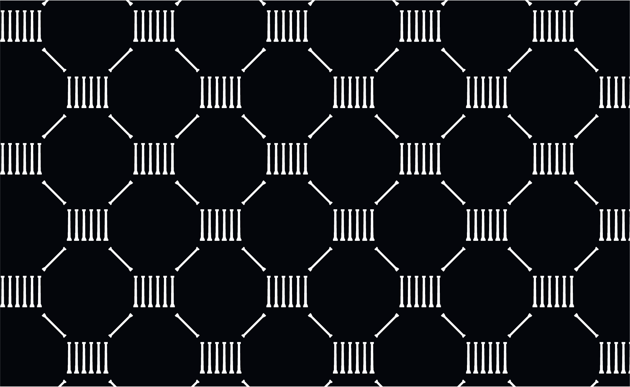
Pattern: White
Background: Black
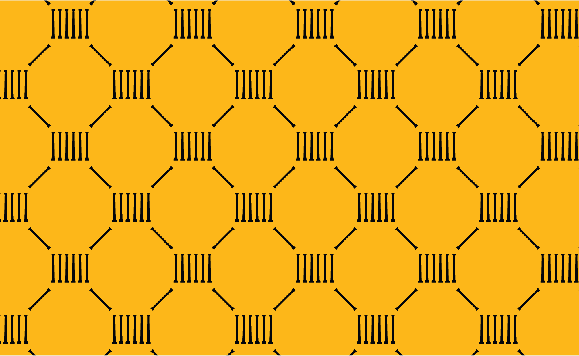
Pattern: Black
Background: Gold
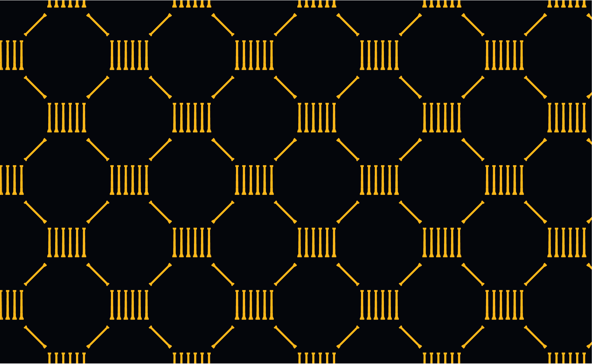
Pattern: Gold
Background: Black
Pattern: Gold
Background: White
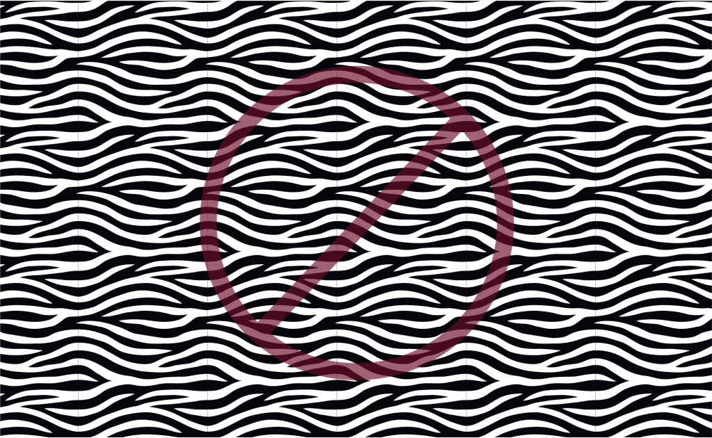
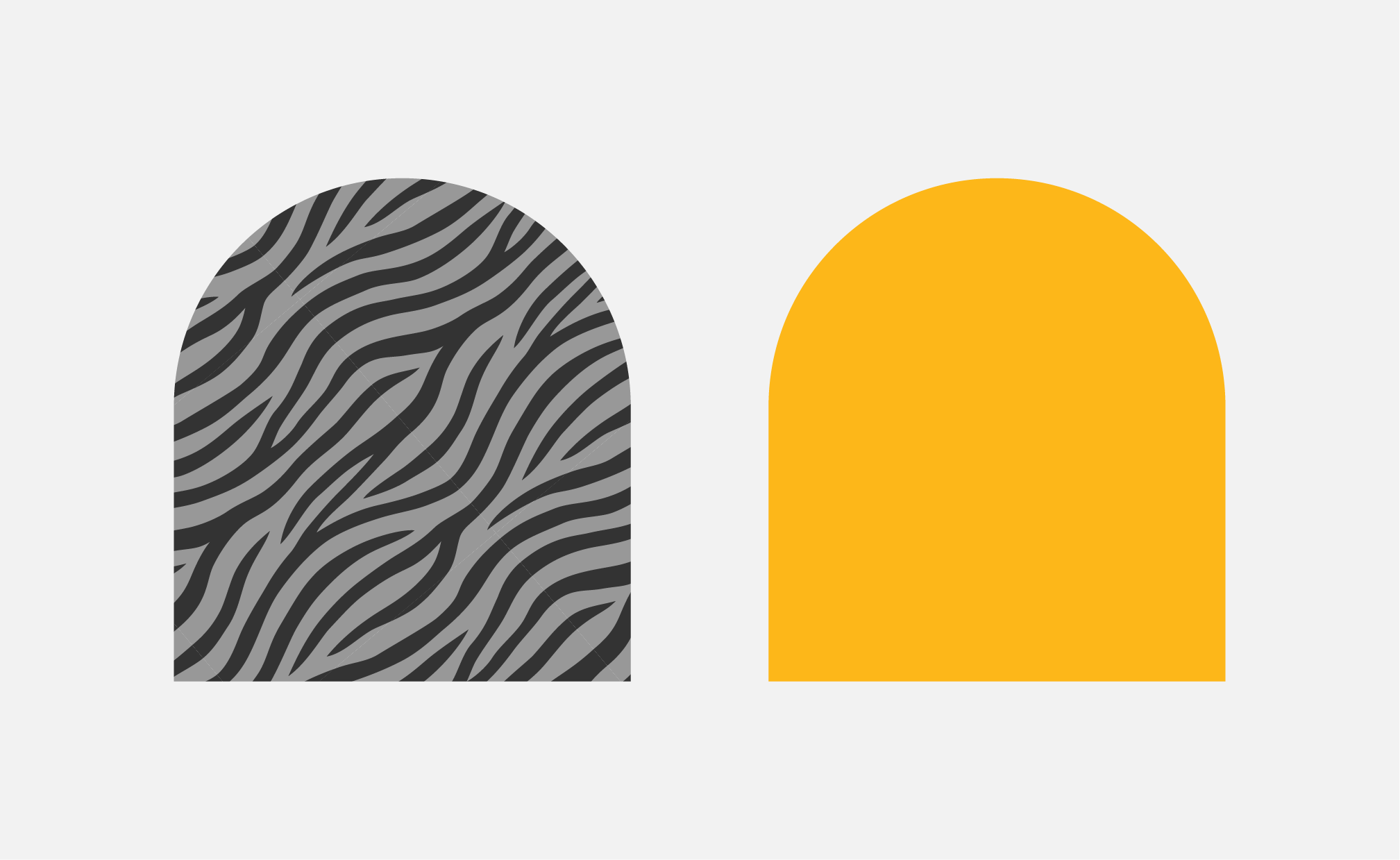
Tiger Stripes
The Tiger Stripes pattern is an evergreen and impactful element of our brand that may be used for all audiences.
When using this pattern:
- It must be rotated 40 degrees.
Do not:
- Use this pattern in a way that looks like waves.
- Use full-strength patterns with copy overlay.
- Recolor patterns or adjust tone-on-tone opacity.
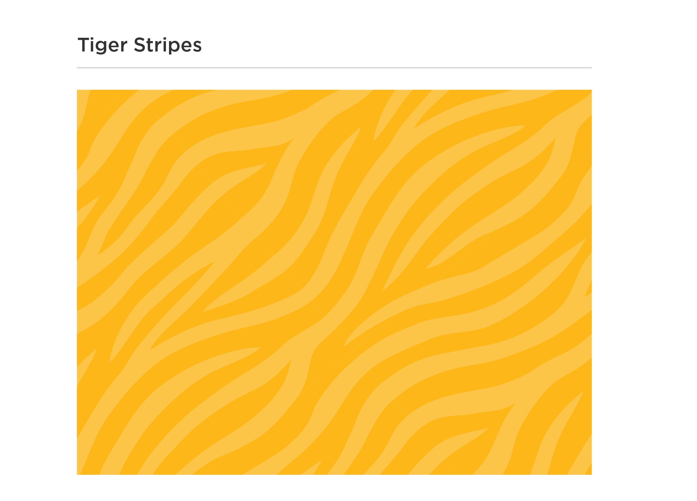
Color Variations
TONE-ON-TONE
The tone-on-tone patterns are the primary versions to use. Copy may be overlaid in the colors noted below.

Pattern: White, 20% opacity
Background: Black
Text Overlay: Gold, White

Pattern: White, 20% opacity
Background: Gold
Text Overlay: Black

Pattern: Black, 20% opacity
Background: Limestone
Text Overlay: Black

Pattern: Gold, 20% opacity
Background: White
Text Overlay: Black
FULL-STRENGTH
Full-strength variations create a bolder graphic effect that may be used in place of full-page photos. Do not place copy on top of full-strength patterns.

Pattern: White
Background: Black

Pattern: Black
Background: Gold

Pattern: Gold
Background: Black

Pattern: Gold
Background: White
M-I-Z Stripes
The M-I-Z Tiger Stripes pattern is an alternate version of the Tiger Stripes pattern with a hidden M-I-Z.
When using this pattern:
- It must be rotated 40 degrees.
Do not:
- Use this pattern in a way that looks like waves.
- Use full-strength patterns with copy overlay.
- Recolor patterns or adjust tone-on-tone opacity.
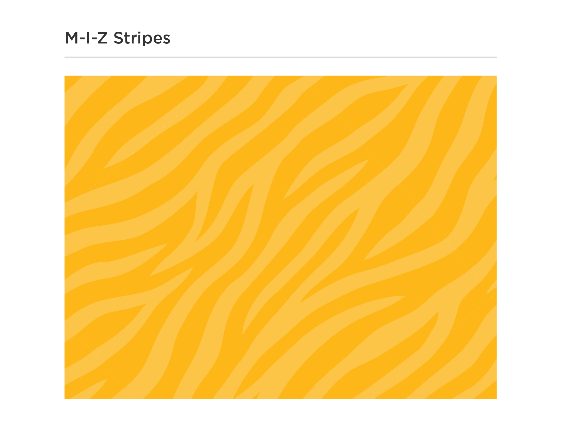
Color Variations
TONE-ON-TONE
The tone-on-tone patterns are the primary versions to use. Copy may be overlaid in the colors noted below.

Pattern: White, 20% opacity
Background: Black
Text Overlay: Gold, White

Pattern: White, 20% opacity
Background: Gold
Text Overlay: Black

Pattern: Black, 20% opacity
Background: Limestone
Text Overlay: Black

Pattern: Gold, 20% opacity
Background: White
Text Overlay: Black
FULL-STRENGTH
Full-strength variations create a bolder graphic effect that may be used in place of full-page photos. Do not place copy on top of full-strength patterns.
Pattern: White
Background: Black

Pattern: Black
Background: Gold

Pattern: Gold
Background: Black

Pattern: Gold
Background: White
Arrows
The custom arrows create association and movement between layout elements and can be layered to show the relationship between photos and copy. The Mizzou brand arrows are derived from the glyphs in Martina Plantijn and are available in the brand toolkits as individual files and custom brushes.
When using arrows:
- Do not use arrowheads that are not derived from Martina Plantijn, regardless of the copy font.
- Do not use arrows for list items or as bullet points.
- Do not use arrows with mastheads or headers.
- Adobe Illustrator users should adjust the brush fidelity setting to smooth before using the custom arrow brushes. Check the arrow’s end point to ensure the arrowhead is not distorted. For more information, visit Mizzou Brand Toolkit.
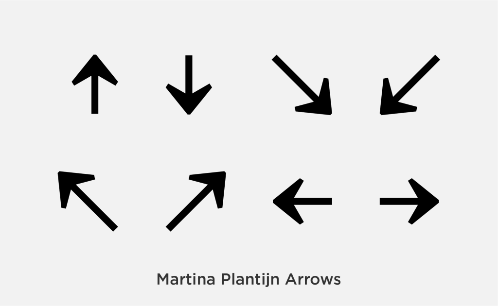
The Martina Plantijn arrows must be used regardless of the brand font.
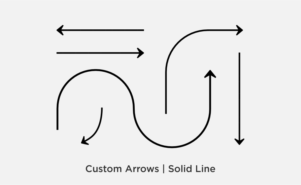
The solid line arrow set may be used to connect information and photos.
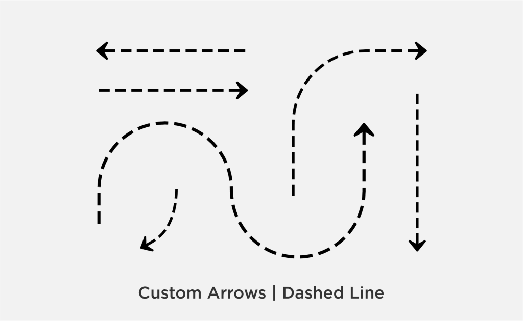
The dashed line arrow set may be used to connect information and photos.
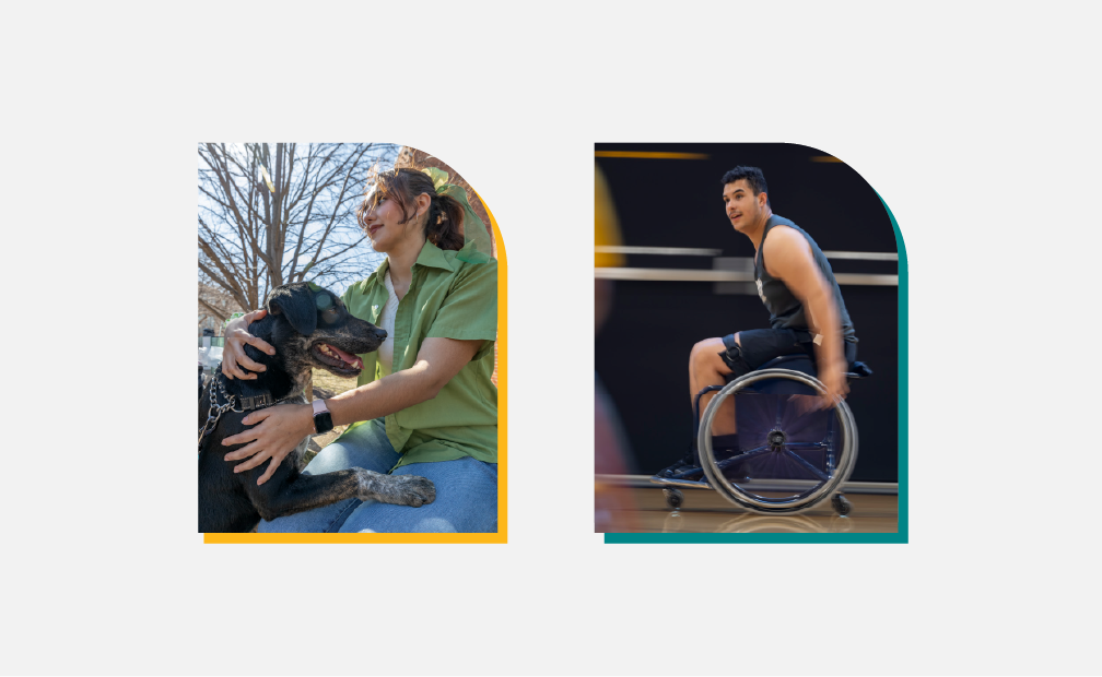
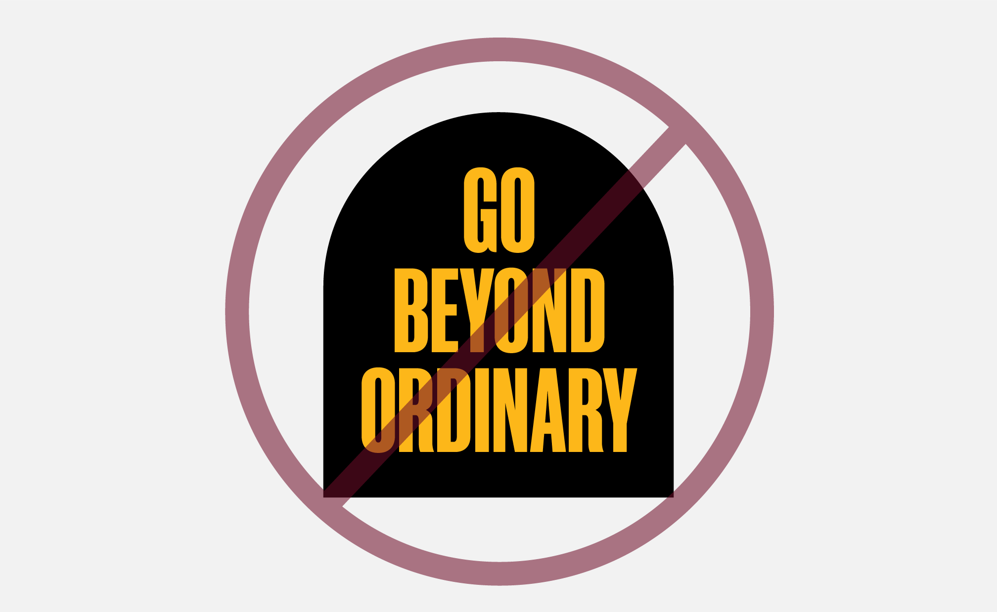
Container Collection
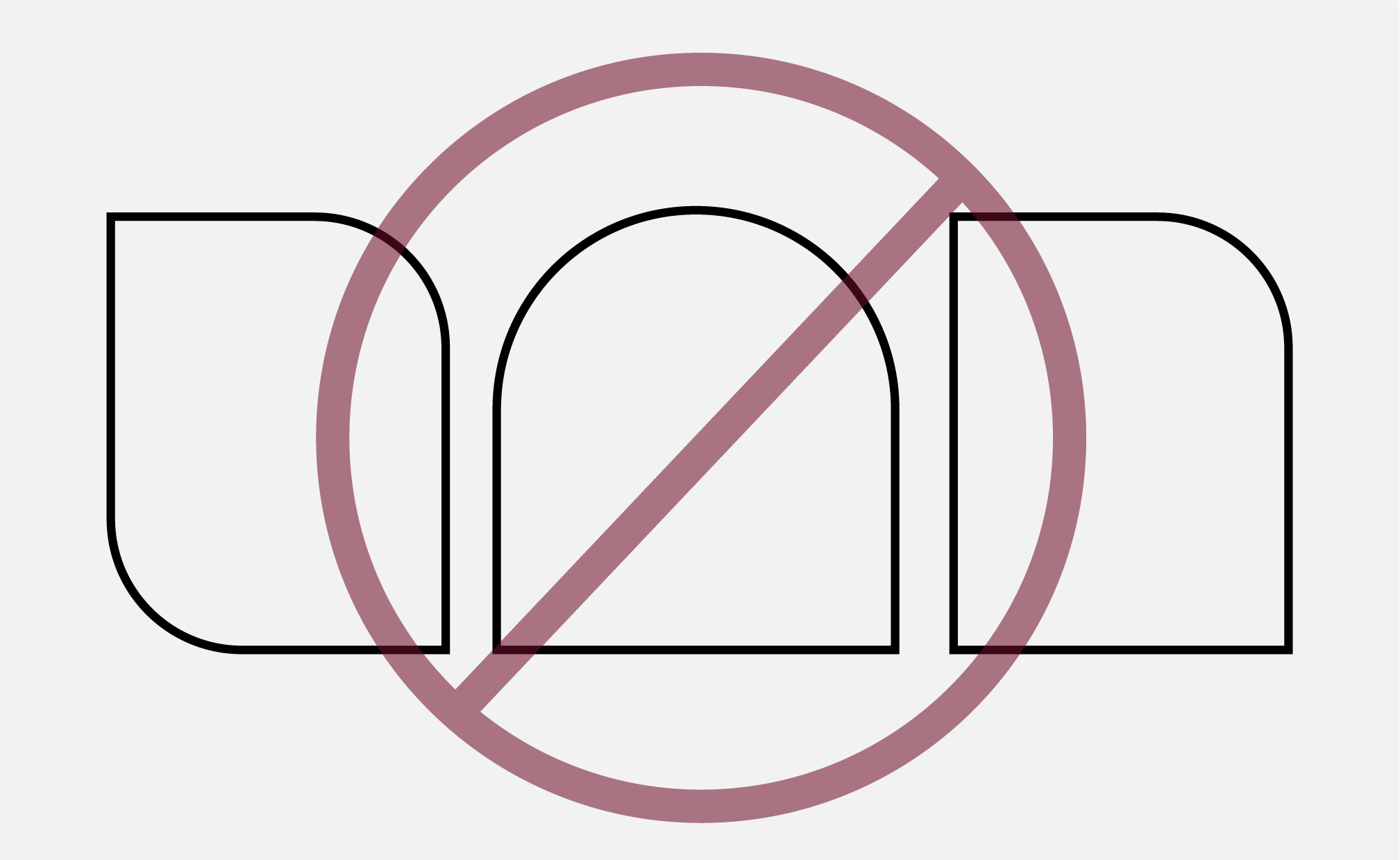
The Mizzou graphic containers establish a set of visually consistent shapes to be used throughout our branded materials.
When using the container collection:
- Images should be appropriately scaled within the container.
- Text may not exceed the boundaries of the container.
- Do not mix containers in the same design.
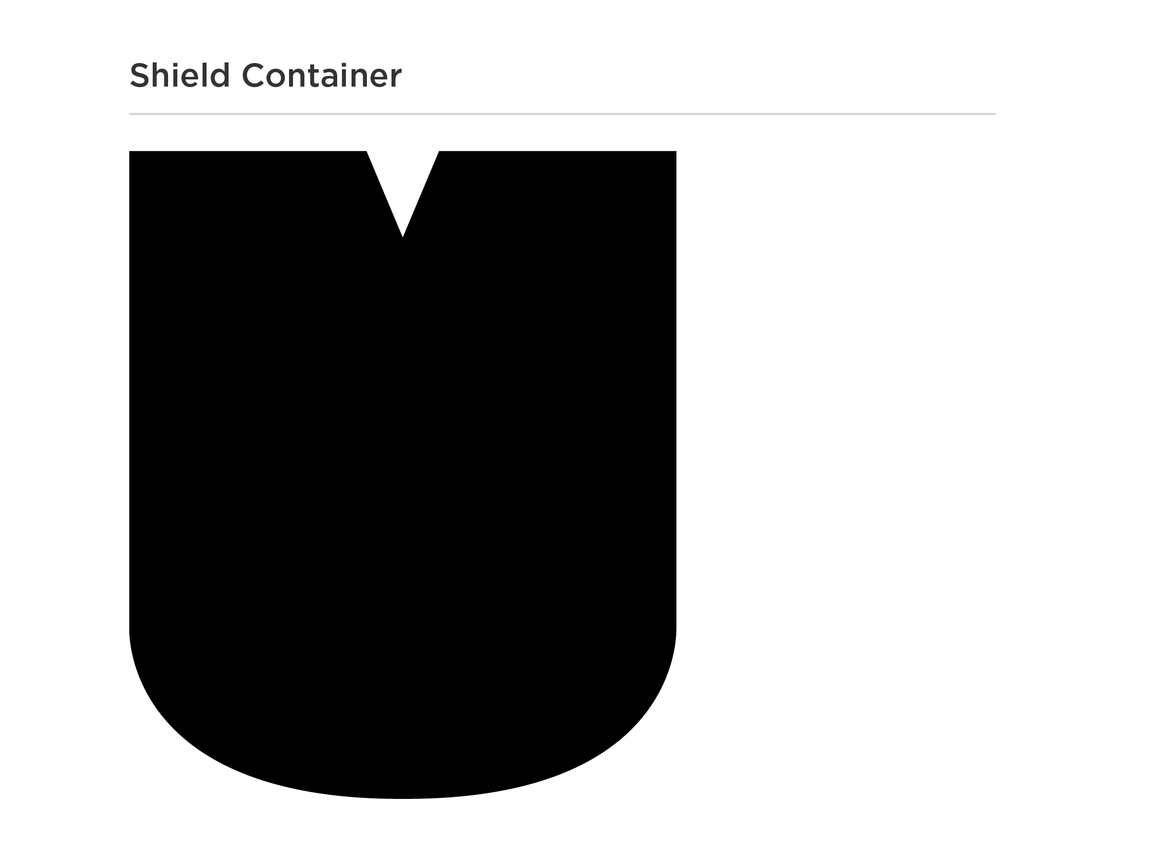
Shield
The shield container is inspired by the Stacked MU mark, creating a bold graphic element directly tied to our identity.
The shield container may be used:
- As a photo container.
- With a short quote or call to action.
- The text must sit comfortably within the shield and may not exceed the boundary of the shield.
- As an outlined shape over the focal point of a photo.
- Outline may be white or gold.
- Outline must be 1-2 pt size. Do not make the stroke too thick or too thin.
The shield container may not:
- Be used as a graphic with only a solid fill color.
- Be filled with a pattern.
- Be rotated.
- Combined or used with the Stacked MU mark.
- Because this container is based on the Stacked MU mark, only one may be used as a graphic on your material.
Shield Container Guidelines & Best Practices

PHOTO FILL
Images must be appropriately scaled within the container.

QUOTE/CTA
The quote/CTA must sit comfortably within the shield. Only primary colors may be used for the fill and text.

OUTLINE
The shield may be used as an outline over a photo to frame the subject.
INCORRECT FILLS
The shield container may not be used as a graphic with a solid fill color or pattern.
INCORRECT TEXT USE
Text may not exceed the boundary of the shield container or filled with body copy.
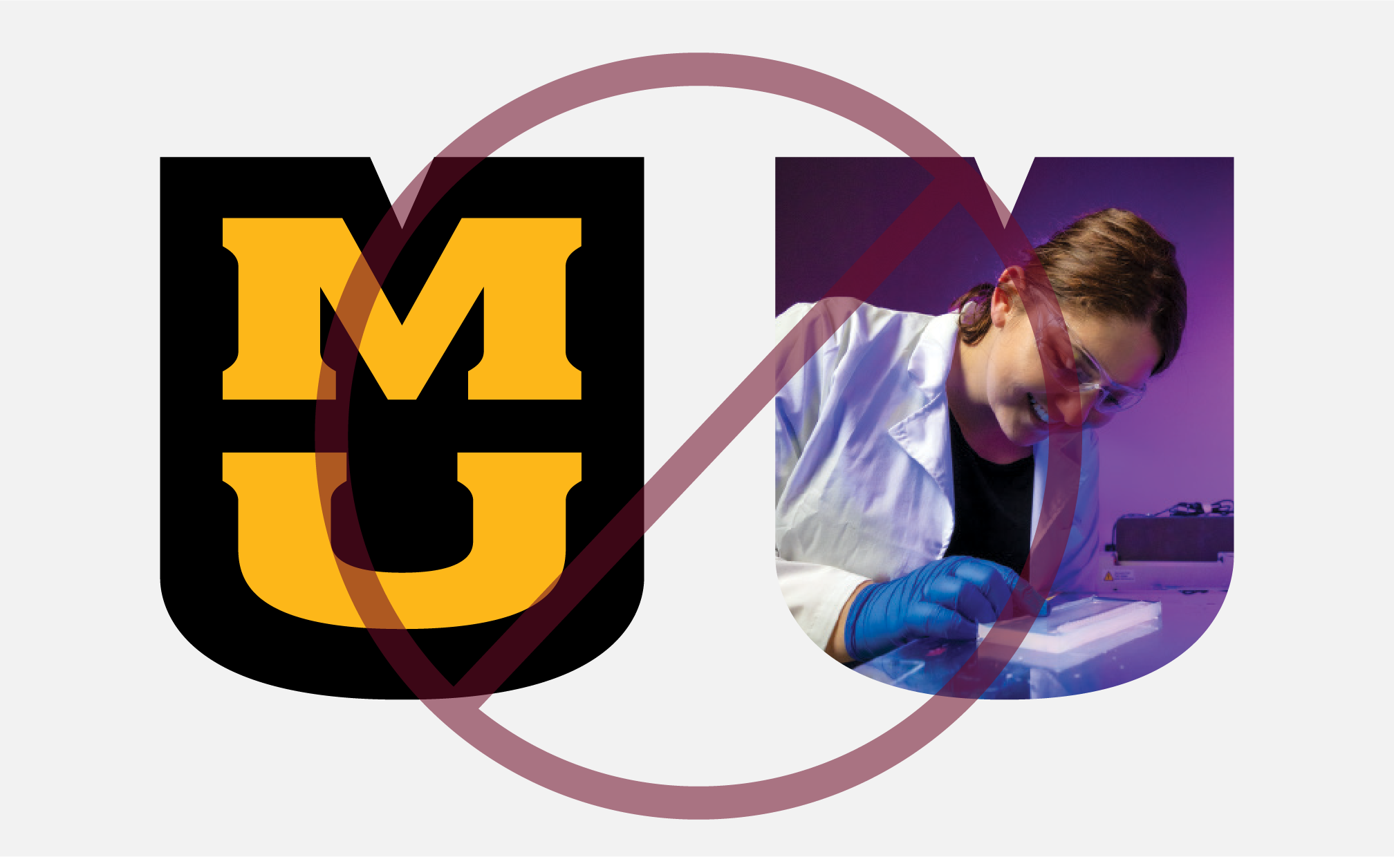
STACKED MU
The shield container and Stacked MU may not be used as graphics together on the same material.
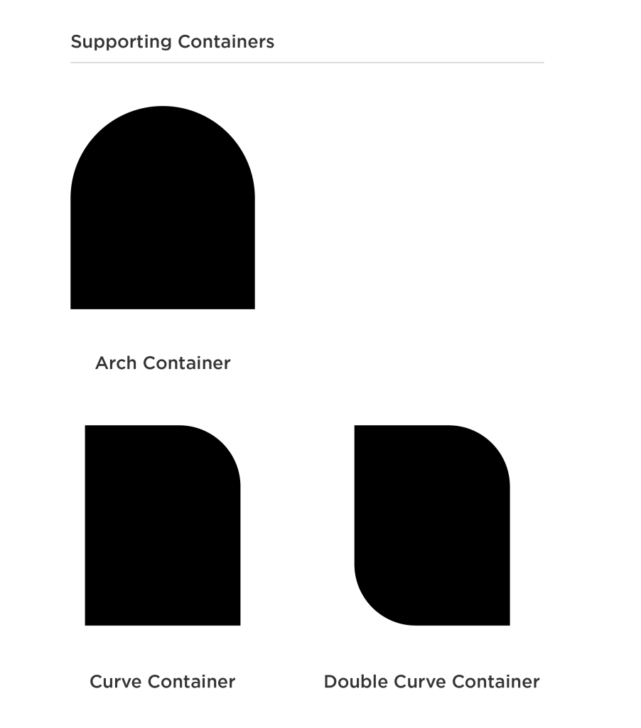
Supporting Containers
The arch, curve and double curve containers are inspired by our campus architecture and may be used on materials for all audiences.
Supporting containers may be used:
- As a photo container.
- As a graphic with a solid or pattern fill.
- Layered and offset behind a photo.
- Rotated in 90 degree intervals (Curve and Double Curve)
Containers may not:
- Be used as an outlined shape. Supporting containers must always have a solid fill, pattern or photo.
- Be used as a copy container (quotes, calls to action, body copy, etc.)
- Be used with the Shield container.
- Mixed together on the same design.
- Rotated (Arch).
Shield Container Guidelines & Best Practices
CONTAINER FILL
Supporting containers may have a solid color or pattern fill.

PHOTO
Supporting containers may be used as a photo container.
LAYERED
A supporting container may be layered with a photo on top and a solid or pattern fill below.
NO OUTLINES
Supporting containers may not be used as an outline. They must be filled with a photo, color or pattern.
NO QUOTE/CTA
Supporting containers may not include a quote or call to action.
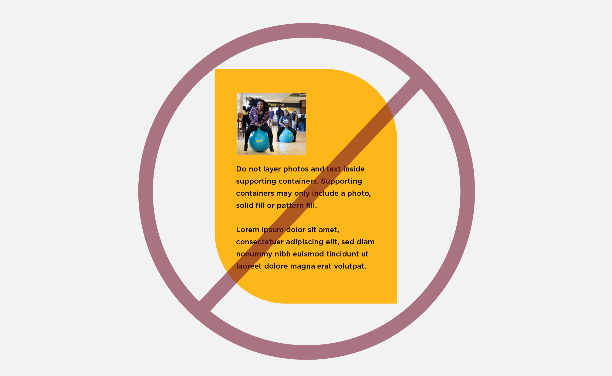
NO PHOTO AND COPY
Do not use photos and body copy inside supporting containers.
Standardized Footers
Footers are where we place important information pertaining to Mizzou. This includes signatures, contact information, URLs and phone numbers. A signature should always be on the left side of the footer. The information on the right side will change depending on the material.
Footer A

Footer B

Footer C

Footer D

Footer E

Photo Grids
Offset grids filled with a variety of subjects and themes help us convey the untamed experience at Mizzou.
Premade grids are available in the Mizzou Brand toolkits to help you place photos in a unique grid system. Additional grid layouts may be created to best suite your materials.

Example photo grid

Example photo grid
Lower Thirds
The Lower Third design provides a consistent typographic treatment for video and animation projects. The design is versatile and accomidate different name and position/title lengths.
The Lower Third design has two color variations. Choose the variation that best suits the background.
Example gold lower third

Example black lower third
Video Bumpers
The Mizzou and school/college video bumpers brand our videos and animations. They can be used as an introduction or outro. Bumpers have been developed for different sizes and include a gold or black background for versatility. Access these assets in the Digital Asset Platform.
Additional Graphic Assets
These graphics are additional resources to help you develop on-brand marketing materials quickly and efficiently. While these elements are not part of the core brand graphics, they do support them.
Anniversary Graphics
Anniversary marks are special graphics that may be created to celebrate milestones. They must be paired with a signature on all marketing materials, apparel, promotional items and merchandise. The premade graphics may be used as-is or referenced when working with a designer to create your own on-brand anniversary graphic.
Download these assets from the Brand Library in the Digital Asset Platform.